Navigating an unfamiliar code base can often be a daunting task. To ease the process of making a mental map from the code to your mind, it can be helpful to sketch out diagrams and graphs to show data flow and structural relationships. It may also be helpful to ask questions about the code, such as, “Which file has the most lines of code?” or “Which procedure has the highest cyclomatic complexity?”
Start by Surveying Land and Sea
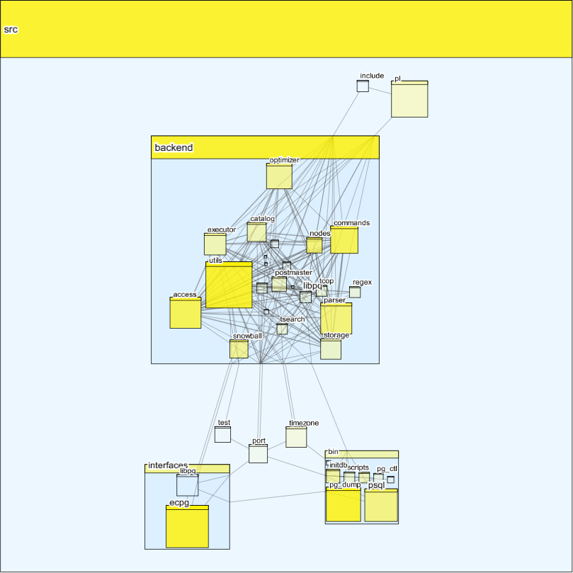
CodeSonar’s visualization tool can help jumpstart this process. The figure below is an automatically-generated call graph based on postgresql.
The graph shown is hierarchical, where a node’s depth in the graph corresponds to its depth in a file system. Node types include directories, files, and functions, where directories may contain files or subdirectories, and files may contain functions. Edges show call/callee relationships between the most deeply nested nodes in the graph, that is, functions. Node sizes are proportional to the lines of code contained in a node.
We can learn a few things by looking at the figure. We can immediately see that all source code is contained in a single directory called src, and that the majority of the code is in the subdirectory backend. Looking at the edges between nodes in src, we can also see that nothing depends on code in bin, and that bin has dependencies on interfaces, timezone, port, and backend.
Taking Notes Along the Journey
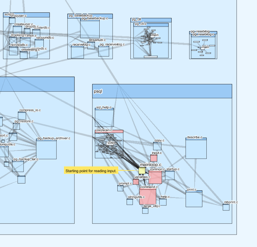
Delving further into the call graph, we can zoom in to see the call relationships between files and their functions. If we zoom into the bin directory, and then further into the psql subdirectory, we can see a file called mainloop.c. Hovering over this file will highlight the caller/callee relationships between it and other nodes. Files with functions that are callees are shown in red. If this file seems interesting, we can make a note about it on the graph.
‘X’ Marks the Spot: Adding Information to your Map
Just as geographical maps can be enriched with information using color, we can add a color intensity to our call graph to represent various code metrics. Zooming back out to the top level, we can view our graph with a yellow color overlay, where a more intense yellow color indicates a higher value for cyclomatic complexity.
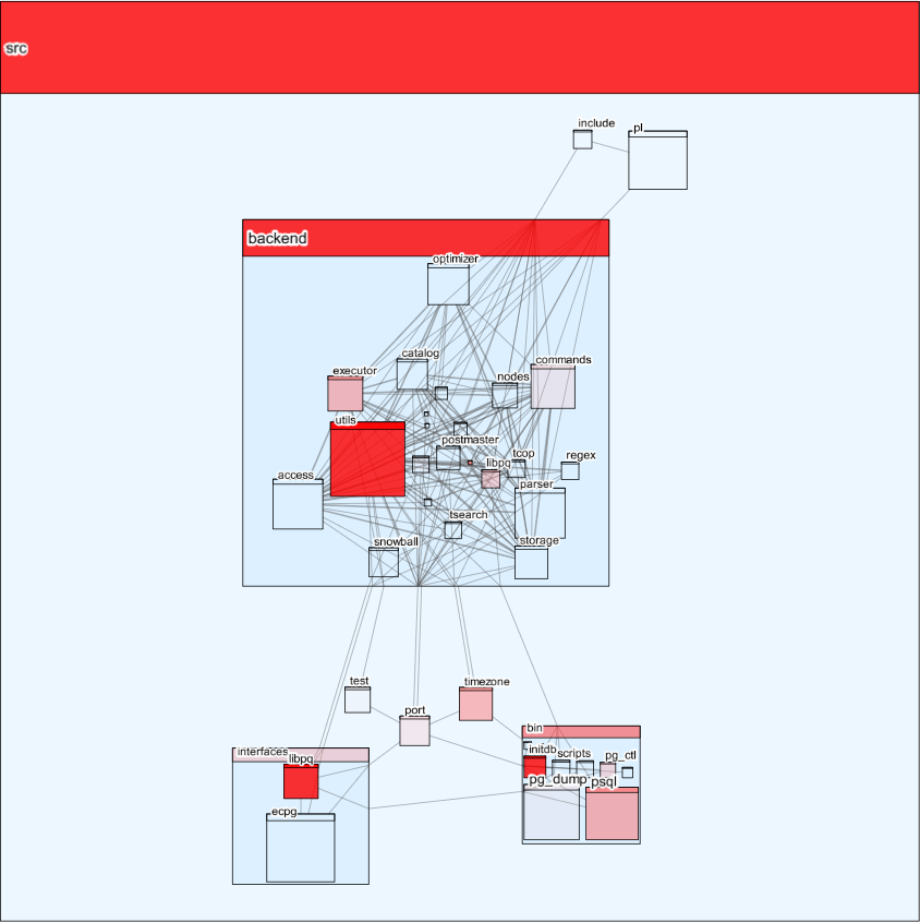
We can view other metrics as well, such as the number of warnings found by CodeSonar. This is shown in the figure below using a red color overlay.
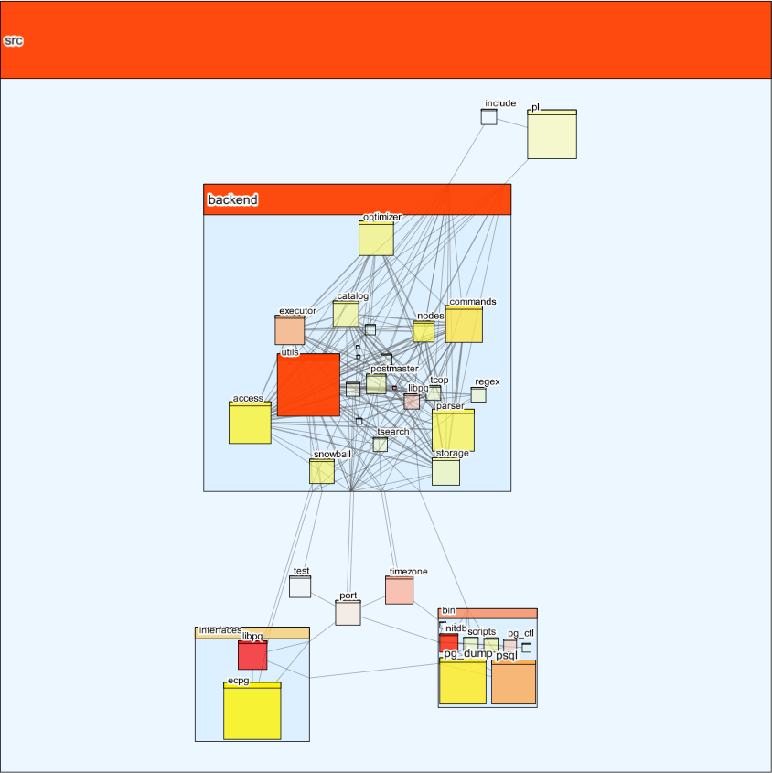
If we wanted to see both metrics at the same time, we can do that as well. This figure below shows a combination of the above two overlays, resulting in a range of color as well as intensity. An orange color indicates similar relative proportions of cyclomatic complexity and number of warnings, while a more purely red or yellow color indicates a higher proportion of number of warnings or cyclomatic complexity.
Bringing it Home
Although familiarizing oneself with unfamiliar code can be a bit like sailing into a vast, unexplored ocean, there are tools we can use to guide us along the way. CodeSonar’s ability to automatically generate a call graph based on static analysis is a bit like having a skilled cartographer at your side.


